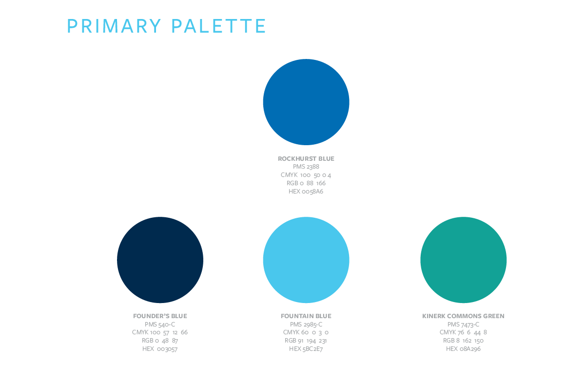
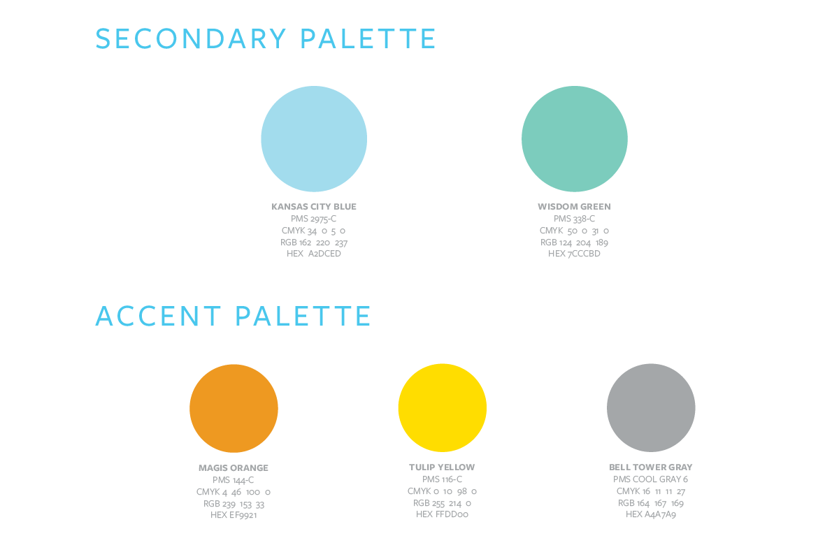
The Rockhurst brand colors are split into primary, secondary and accent palettes. These colors have been given names to reflect unique aspects of our University.
Blue is a color traditionally associated with knowledge, trust and stability and is the primary color for our University. Greens are typically associated with growth, prosperity and creativity. These colors pair well together to represent the Rockhurst experience.
Our accent palette is reserved for instances where sharp contrast is needed for emphasis or distinction. The accents should rarely be used and never in more than 5% of an overall design. When using brand colors, be sure to use the specific builds noted here as they have been adjusted for the most accurate reflection of our colors.